Branding is so much more than just perfecting your logo and diligently applying your brand colours to your collaterals. It covers everything from colours, to typeface, to copy. Every element has to work together to create a consistent brand personality and image.
Here are three aspects of branding that are often overlooked.
1. Typeface
Choosing a typeface for your brand is serious business. It is a critical element of design that has both functional and aesthetic purposes. Your choice of typeface doesn’t just affect the legibility of text, it also conveys the personality of your brand.
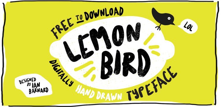
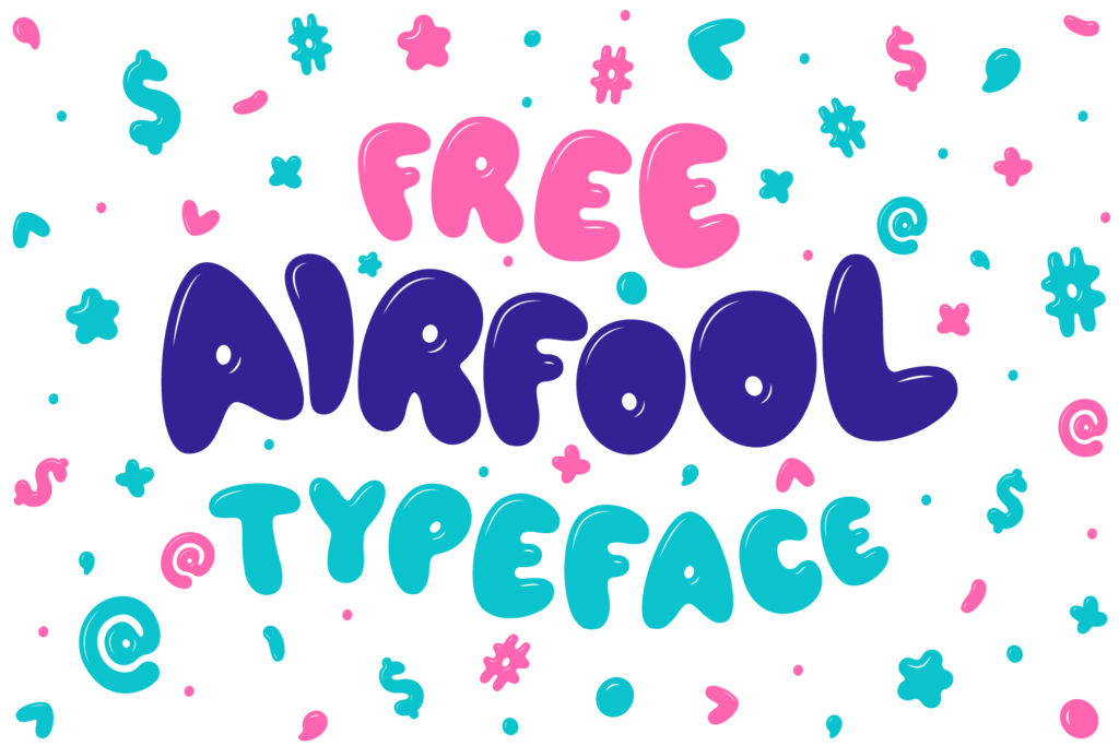
Playful typefaces, such as Lemon Bird and AirFool, can help you establish a fun-loving image.
If it is important to maintain a professional and business-friendly image, more traditional typefaces like Source Sans Pro and Cinzel would be more appropriate.
Some brands, like Netflix and Airbnb, have even gone to the extent of creating their own typefaces. In fact, custom typefaces are a growing trend; even smaller companies are investing in them.

Via It’s Nice That
A striking, unique typeface will help differentiate your brand, as well as boost the memorability of your brand. Another upside of having your own typeface: you save on licensing fees in the long run.
2. Layout
Another overlooked aspect of branding is the layout of your collateral designs.
Layout refers to how elements are arranged on a page. It works with copy and other design elements to present a certain image of your brand. The layout of your collaterals can say a lot about your brand – whether you’re formal or playful, traditional or avant-garde. Less conventional brands may decide to break free from conventional grids.
Check out these invitation cards we’ve designed for two very different brands – Siemens and Eyedentity.

Notice that Siemens has a more conventional looking card. Since professionalism and reliability are two important aspects of Siemens’ brand, the invitation card had be designed accordingly. Eyedentity, on the other hand, is a new optical brand that champions self-expression. Its invitation card walks the talk with bold colours and unconventional folds.
3. Tone of Voice
Just as a person’s speech mannerisms can inform you of his or her personality, a brand’s tone of voice will influence how consumers see it. How your brand speaks – the tone of your copy – tells your audience about your brand personality. The words you use and how you phrase sentences all play a part in building your brand’s image.
Compare these two Instagram posts from fashion brands Superdry and In Good Company.
View this post on Instagram
Beat the chill in style with the Everest Ella bomber, win-win. @joelmignott 🔎154260
View this post on Instagram
An architectural style with modern lines and strong shoulders. #IGCasia #IGCmari
Notice how these two posts have the same goal – to promote a piece of clothing – but very different tones of voice. Superdry uses more colloquial language while In Good Company has a more formal, reserved tone. This makes sense because Superdry and In Good Company have very different brand personalities. Superdry sells more casual, trendy clothes whereas In Good Company’s clothes are more sophisticated in style. Their tone of voice matches their brand image.
The tone of your copy is an integral part of your brand. Copy and visuals work hand in hand to build your brand image.
—
We hope this article has given you deeper insight into the branding process. Remember to keep these three points in mind whenever you’re designing your communications to build a more holistic brand.