This is part one of our Basics of Design series. Whether you’re a new designer, a wannabe or a non-designer looking to learn more about the field, this series of articles contains all the essential information to help you get started.
—
Have you ever wondered how designers work their magic; how they know where to place things, what colours to use and how big to make something?
There are actually core rules to design, or what we call the principles of design, that guide the process. Whether you’re designing a logo, a newsletter or any other material, applying these principles will improve the clarity and comprehensibility of your final product.
Let’s begin with the first principle.
1. Balance

Balance has to do with visual weight. Bigger elements, dark colours as well as bold typefaces tend to be more visually heavy. Balance is achieved when the weight of all design elements across a space is distributed in a way that preserves the equilibrium.
This is illustrated in our logo design for Pedal Vault. The heavier element of the shoe on the left of the logo below is balanced out with the bolded typography on the right:
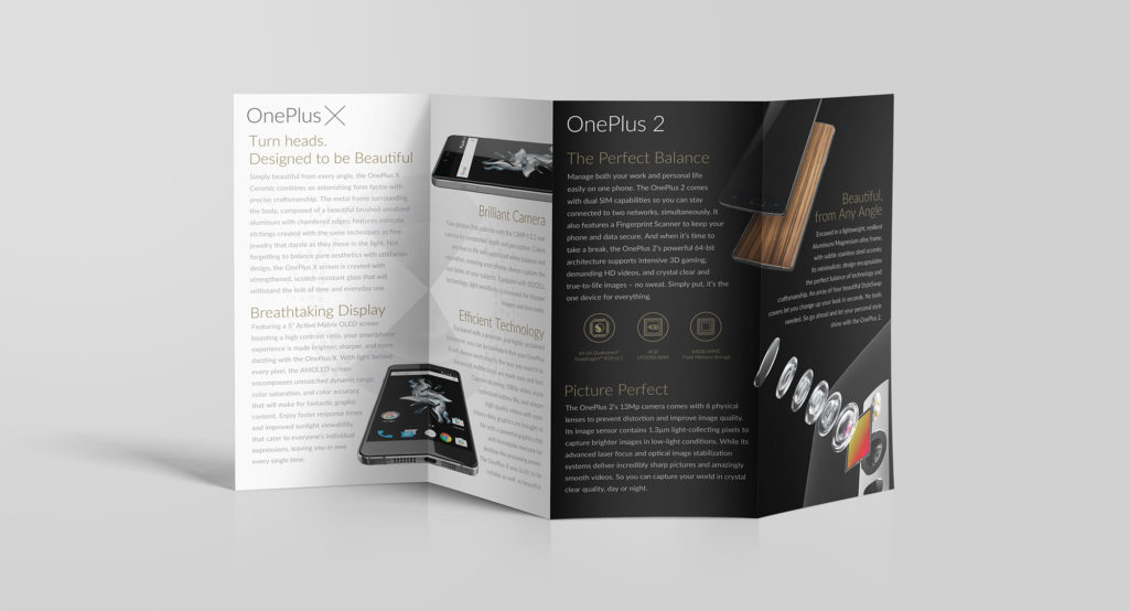
Apart from just being more aesthetically pleasing, a balanced design ensures that the viewer’s attention is well-distributed across all the elements. In our brochure design for OnePlus, the visuals of the phones aren’t just used to counter the visual weight of the text, they are also positioned in a way that invokes overall visual balance.

2. Repetition

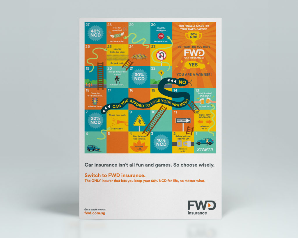
Repetition is the reusing of visual elements throughout a design to create continuity and unity. It can be in the form of a pattern as shown below in our design for FWD:
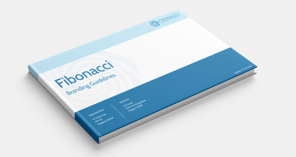
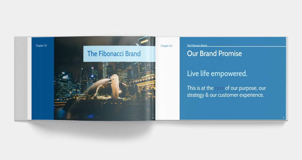
Repetition can also be injected with the use of the same colour. This is particularly relevant to designing marketing collaterals where brand colours should feature strongly for the purpose of maintaining brand integrity. Check out how we incorporated Fibonacci’s blue into every page of their brand book:
3. Contrast

Contrast is the juxtaposition of opposing visual elements in the same space. The simplest illustration of contrast would be how you would use black text over a white background and white text over a black background. However, contrast isn’t just limited to colours. It also applies to textures (rough versus smooth) as well as sizing (big versus small).
Contrast is a good way to emphasise certain visual elements. In our newsletter design for Keat Hong Constituency, the stark contrast between the saturated colours of the photographs and the light green aesthetic draws the reader’s attention to the photos. A complementary colour and a much larger type are used for the header so that it stands out from the body.

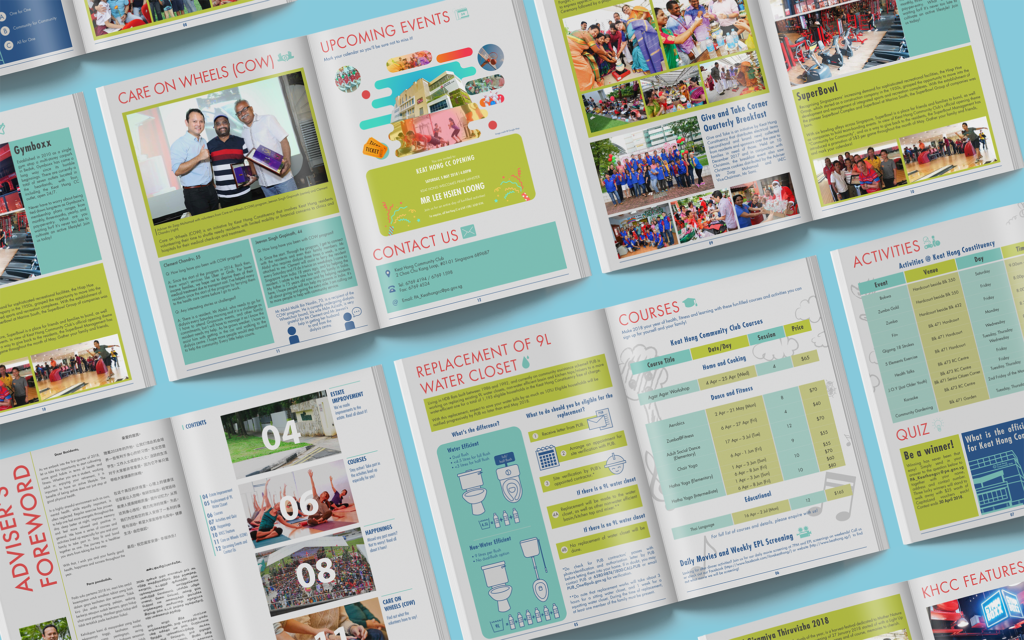
This is also an example of how contrast can be a good way to create hierarchy.
4. Hierarchy

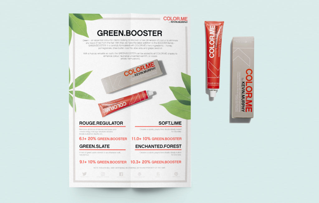
Hierarchy guides the reader through the space and informs them of the sequence in which to view it. Examples of this concept can be found in brochures, newsletters and any other collateral that is information-heavy. In order to improve clarity and to guide the reader through the content, information is usually segmented by headings and columns as shown in our poster design for Kevin Murphy:
Contrast is essential to creating hierarchy. If all the visual elements in a space were of the same size you wouldn’t be able to tell where to look first. The tent card below shows how you can use scale to create hierarchy as well as attract attention:

5. Emphasis

This ties in with the concept of contrast. Emphasis tells the reader what to pay attention to. Elements that you want emphasised can be made to stand out by increasing its size; or using a different colour or style.
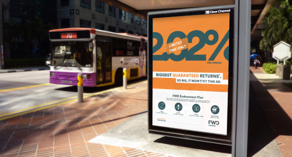
Take a look at the web banner and bus shelter ad that we designed for FWD and see how we made “2.02%” jump out by playing with scale and contrasting colours. This makes the ads especially effective at attracting the attention of site visitors and passersby.

Emphasis also lets readers know what they should look at first or focus on as shown in our envelope design for FWD below.

We hope these guiding principles have enlightened you a little and have made design seem less intimidating. This is just the first step. In part two, we’ll give you more insights into the actual designing process so stay tuned!
If there are any other tips you’ve found useful and would like to share, be sure to leave a comment below.