Imagine yourself in a bookstore with shelves and shelves of books around you. How do you decide which book to pick up?
Let’s face it: we all judge a book by its cover, at least initially. That is why its cover design is just as important as its contents. In his TED Talk Designing books is no laughing matter. OK, it is, graphic designer Chip Kidd shares the inspiration and process behind his book designs.
The talk isn’t just funny, it also provides insights into designing for marketing, in particular, designing content for social media. We’ve compiled a couple of those insights into this article. But first, watch the video if you haven’t – we promise it’ll be worth it.
1. Understand your goal
A book cover is essentially a marketing device that functions primarily to get people interested in the story. It doesn’t just have to effectively convey the premise of the story, it also needs to stand out from the other books on the shelf.
Similarly, social media visuals need to effectively grab the attention of your target audience as well as have a clear message. So your marketing designs, like a book cover, should be nothing short of eye-catching.
In his talk, Kidd shares his thought process behind some of his works. Below are some methods he has employed in his designs to get people’s attention.
2. Know the rules so you can break them
Kidd gives a really great example of this in his talk when he spoke about his design for Augusten Burroughs’ memoir Dry. He starts off describing one of the basics that he’d learnt in Typography class – making a word look like what they mean:

Taken from Kidd’s TED talk.
Then he describes doing the exact opposite in his cover design.

Via 99designs
A book that looks like it got ruined by water is bound to attract significant attention. And it did. The ingenuity of this design is that it doesn’t just aptly convey the contents of the book, which is about the author’s battle with alcoholism, it also compels people to pick up the book to get a closer look.
In order to make your ad or content stand out, you need to do something different, something unconventional; and you wouldn’t know what’s unconventional until you’ve understood the conventions.
3. Think outside the box
Another thing that makes Kidd’s designs so good is his willingness to think outside the box. In his design for Haruki Murakami’s 1Q84, a book that centres around a girl who travels across parallel planes of existence, Kidd uses the book jacket and cover to represent two separate planes. Check out his explanation in the video below:
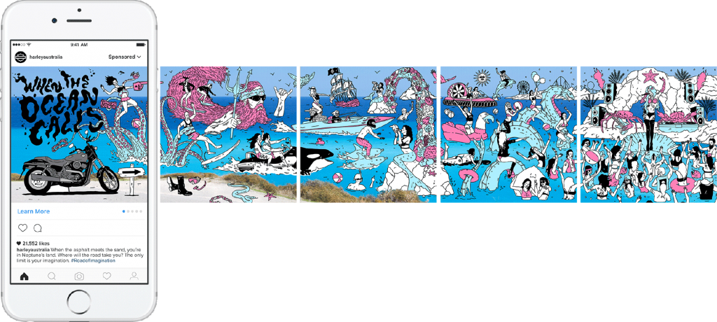
So find creative uses of your medium. Take a look at how Harley Davidson made use of Instagram’s carousel function to create one large, continuous image out of four separate images.
Remember: the more unique you are, the more memorable your brand becomes.
4. Design for context
Kidd designed My Name is Red by Orhan Pamuk with context in mind. He envisioned the entire book selection process – from scanning the shelves to pulling out a book – and found a way to design the cover in a way that illustrates the story premise through that process. 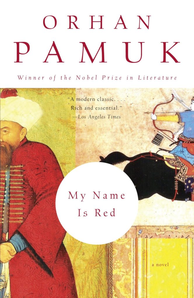
Via Knopf Doubleday
When designing for your brand’s social media page, think about this: how will your target audience interact with your ad? Do they swipe? Scroll? Tap? How can you make it interesting for them? The above Harley Davidson visual is also a great example of how asking yourself this can lead to creative uses of social media functions that surprise and delight your audience.
So the next time you need a visual for your social media page, try to apply Kidd’s creative process to create something fun and different for your followers.
Learnt anything else from the talk that you would like to share? Leave them in the comments below.